
Client: Cogo Coffee
Cleveland, Tennessee 2026
Goal: Create a logo that translates ‘to gather around’.
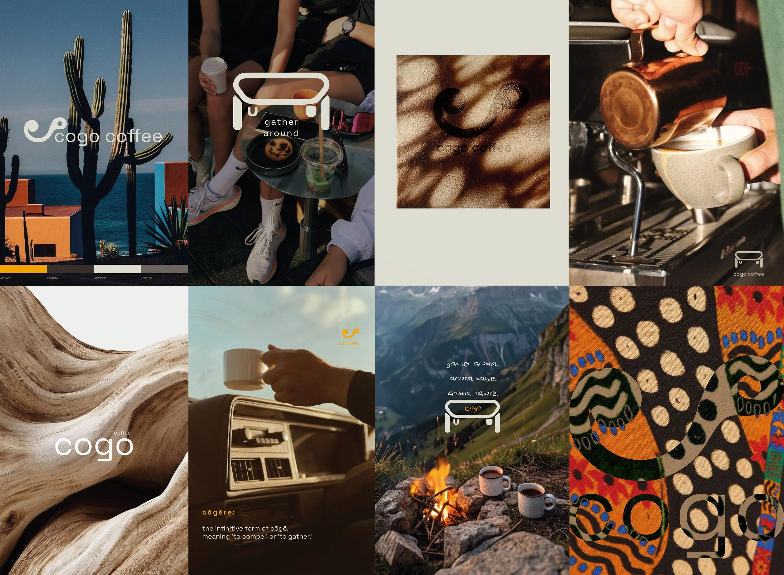
Mood Board
01
Intentional
Structure
Include elements of playfulness with simplicity and distinctive recognision.
02
Collaborative
Energy
Keep in line with natural tones, but with an energetic addition of a vibrant colour.
03
Adaptable Alternative
Create an additional logo – table. Indicate friends gathering around and the brand hosting future events.
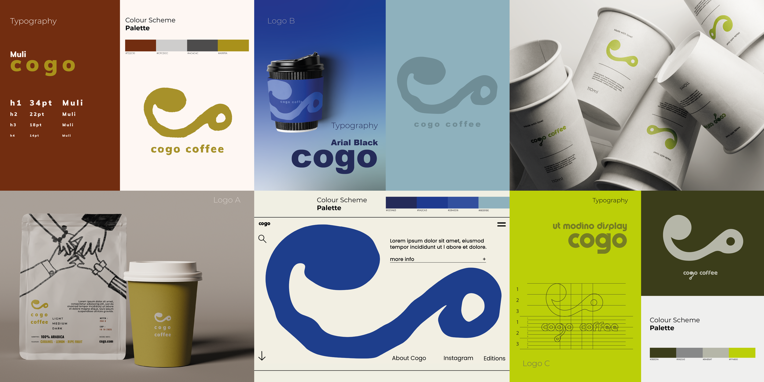
Developing Process
Design process included logo variations, colour combinations, mixture of fonts, and elements that gave the client a visual aid of the direction the brand sought-after to embrace.
-
Defining brand’s core values and tailoring solutions was the primary goal. The vision was to connect with an individual before they even become a customer.
-
Researching, experimenting, and creating a distinct point of view.
-
Not here following trends – building something timeless. Blending creativity, strategy, and purpose.
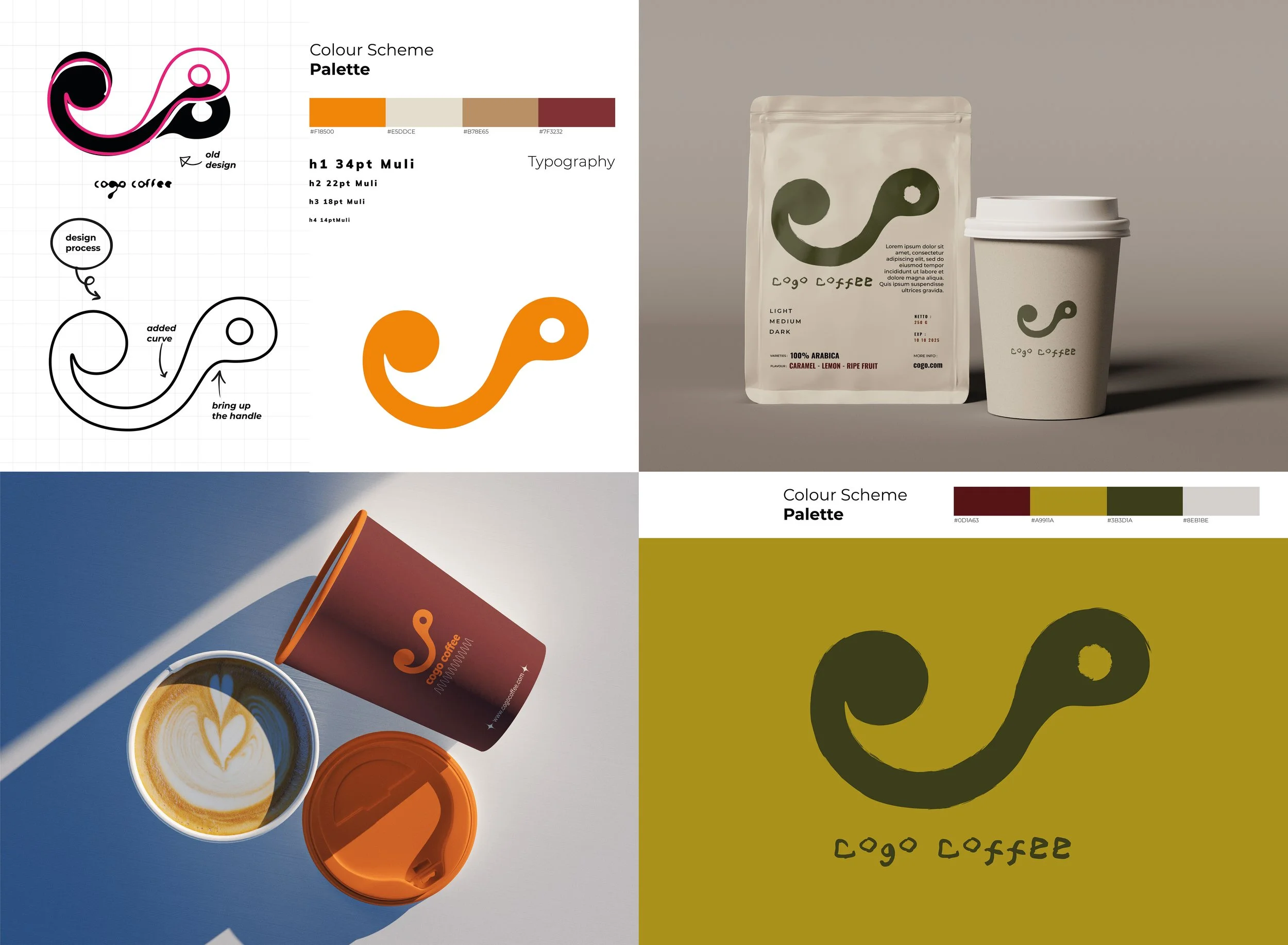
Back to the drawing board.
Multiple rounds of evaluating variations of the logo to expand on existing design. Giving more intention to harmonise the structure of the overall design.
Big ideas, real impact.
With a blend of creativity, strategy, and heart, the concept came to life.
